7 Tips for Choosing a Red Living Room Rug
Choosing a Red Living Room Rug can reshape a room before you move a single chair. Its color adds warmth, drama, and visual direction. Yet red is rarely a quiet decision.
“Color is the backbone of design,” says Maria Killam, a respected color expert and interior design educator. Her view is useful here. A rug is not merely a floor covering. It influences how nearby walls, sofas, wood tones, and lighting appear.
This guide explores seven practical tips for selecting the right Red Living Room Rug. You will consider shade, size, pattern, material, pile height, placement, and maintenance. A deep burgundy rug may create a calm, library-like feeling. A bright cherry design can energize pale furniture. Under evening lamps, however, both shades may look stronger than expected.
Test it at home.
View a sample beside your sofa during daylight and after sunset. Check whether the rug fights with curtains, artwork, or existing cushions. Measure the seating area carefully, because a beautiful rug can still look undersized. Ideally, its front edge should reach beneath the main seating pieces.
Personal experience matters, too. A low-pile wool rug can suit frequent foot traffic, while a thick shag may feel softer but trap more crumbs. I would not claim that one red works everywhere. Room size, natural light, and lifestyle change the answer. Even expert advice needs testing against real floors, real furniture, and real habits.
These seven tips will help you make a confident choice, while leaving room for thoughtful reconsideration.
Set Red’s Undertone and CIE L*a*b* Values Against Existing Room Colors
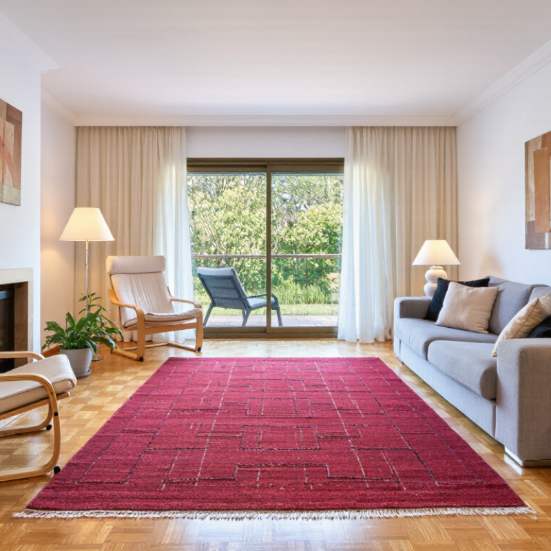
A red living room rug should be judged against the room, not alone. Begin by identifying its undertone: blue-red feels cooler, while orange-red appears warmer. Hold the sample beside the sofa, wall, timber, and flooring in daylight. Artificial light can shift red toward brown or purple.
Use measured color data when visual judgment feels uncertain. ISO/CIE 11664-4:2019 defines CIE L*a*b* coordinates, where L* represents lightness, a* spans green to red, and b* spans blue to yellow. A rug with a high positive a* value may look vivid, but its b* value reveals its warmth. Compare these values with existing room colors. A warm beige wall can make a neutral red appear cooler by contrast.
Record the readings.
CIE 015:2018 identifies standardized color measurement as essential for consistent evaluation. For closer comparison, calculate ΔE00 under ISO/CIE 11664-6:2014. Smaller differences usually indicate closer visual matches, but texture and pile height still interfere. My first sample looked balanced on a screen, then clashed beside yellow oak flooring. The mistake was relying on appearance alone. Measure samples under morning and evening lighting. If the rug’s L* value is much lower than the sofa’s, the seating area may feel visually heavy. A slightly muted red can work better than a brighter one, even when the numbers seem less exciting. Check twice.
7 Tips for Choosing a Red Living Room Rug - Set Red’s Undertone and CIE L*a*b* Values Against Existing Room Colors
Reference color values are approximate sRGB-to-CIE L*a*b* conversions under D65 illumination and the CIE 1931 2° standard observer. Values are rounded for practical interior-design comparison.
| Tip |
Existing Room Color |
Room Color Reference |
Red Rug Direction |
Red Sample |
Approx. CIE L*a*b* |
Undertone Relationship |
Practical Selection Note |
| 1 |
Warm ivory |
#F5F0E6
L* 95, a* 0, b* 7
|
Brick red
|
#A33B2F |
L* 37, a* 44, b* 31 |
Both colors lean warm, creating a cohesive and welcoming combination. |
Choose a medium-dark red to add definition without making the room feel stark. |
| 2 |
Cool gray |
#A7ADB4
L* 69, a* 0, b* -3
|
Blue-red burgundy
|
#7D1F3A |
L* 26, a* 43, b* 8 |
The slightly blue red echoes the cool bias of gray instead of appearing orange. |
Use burgundy or wine red when the room has silver, black, or blue-gray accents. |
| 3 |
Natural oak |
#B88752
L* 57, a* 16, b* 38
|
Muted terracotta
|
#B5543C |
L* 43, a* 40, b* 32 |
The orange-red undertone harmonizes with the yellow-orange bias of oak. |
Avoid a highly blue red, which can make warm wood look more yellow by contrast. |
| 4 |
Sage green |
#A8B19A
L* 69, a* -7, b* 10
|
Cranberry red
|
#9E1B32 |
L* 34, a* 47, b* 20 |
Red and green are complementary color families, so moderate saturation works best. |
Select a softened cranberry rather than an intensely bright red for a balanced look. |
| 5 |
Deep navy |
#1F3A5F
L* 23, a* 8, b* -24
|
Clear warm red
|
#B22222 |
L* 37, a* 56, b* 42 |
Warm red supplies energetic contrast against navy’s cool blue undertone. |
Keep the rug pattern controlled if both the rug and upholstery are strongly colored. |
| 6 |
Taupe beige |
#B8A99A
L* 69, a* 4, b* 9
|
Dusty rose red
|
#A65D5D |
L* 46, a* 29, b* 14 |
The low-chroma red shares taupe’s muted quality and avoids excessive visual noise. |
Choose a dusty or washed red when the room relies on soft, layered neutrals. |
| 7 |
Charcoal |
#3B3B3B
L* 24, a* 0, b* 0
|
Deep neutral red
|
#8F1D2C |
L* 31, a* 42, b* 18 |
Charcoal is close to neutral, allowing the red undertone to become the focal point. |
Use a deep red with enough lightness contrast to remain visible on dark flooring. |
How to read the values:
In CIE L*a*b*, L* describes lightness, a* runs from green to red, and b* runs from blue to yellow. Compare the rug and room colors under the same lighting, because daylight, warm bulbs, and surrounding furnishings can change perceived undertones.
Size the Rug with a 6–12-Inch Border and Front-Leg Furniture Placement
A red living room rug can anchor the seating area and warm up neutral walls. Its size matters more than its color. Measure the seating zone, not only the open floor. Leave a 6–12-inch border of visible flooring around the rug. This gap frames the rug without making it look undersized. A 12-foot room may need a larger border than a compact apartment.
Place the rug so the front legs of the sofa and chairs rest on it. This arrangement connects the furniture visually and prevents scattered-looking seating. Keep the rear legs on the floor if the rug cannot cover everything. The front edge should sit several inches beyond the sofa legs. Otherwise, the rug may appear too short. A coffee table should stand fully on the rug, with walking space around it.
I once used a six-inch border in a bright room.
It looked neat, but the red rug felt slightly cramped. A wider border created better breathing room. This rule is not perfect. Use painter’s tape to mark the proposed rug size before buying. Check door swings, vents, and walkway clearance. Leave at least 24 inches for a comfortable passage. Lighting can also change the red tone, making it appear deeper at night. A small mistake is easier to fix with tape than with a rolled rug.
Choose Fiber and Pile by ASTM D5252 Wear-Test Results and Traffic Level
When choosing a red living room rug, read the ASTM D5252 wear-test report before trusting a soft sample. This standard uses a hexapod tumbler to simulate repeated foot traffic. Many laboratory procedures assess appearance after 12,000 revolutions. A stronger result usually means better resistance to crushing, matting, and visible wear. It does not guarantee perfect performance at home.
Match the reported result to your traffic level. A hallway-style living room with children, pets, and daily walking needs a dense, low-pile construction. Short nylon or polypropylene fibers often recover better than loose, high-pile yarns. Wool can feel luxurious, but its performance depends on density, twist, and maintenance. Check the actual test outcome, not only the fiber label. The Carpet and Rug Institute’s carpet-care guidance also stresses frequent vacuuming, because trapped grit acts like sandpaper.
Low traffic is different. A medium-pile rug may work near a sofa with occasional use. Still, thick pile can show furniture dents and uneven red shading. Bright red can also reveal fading beside sunny windows. Use a rug pad and rotate the rug every few months. One weakness in my own selection habit is focusing on color first. That mistake is easy to repeat. Ask for the D5252 result, pile density, fiber type, and cleaning instructions in writing. A beautiful red rug should survive the room’s real footsteps.
Red Living Room Rug Selection by Traffic Level
Recommended minimum appearance-retention targets are shown on the ASTM D5252 1–5 scale, where higher scores indicate better resistance to visible pile change after wear testing.
Practical selection guidance: choose denser loop or low-cut pile constructions and durable fibers as traffic increases. ASTM D5252 provides a wear-test rating scale; it does not define universal residential traffic pass/fail limits.
Check Dye Stability Under AATCC TM16.3 Lightfastness Testing
7 Tips for Choosing a Red Living Room Rug
Red dye can fade unevenly near bright windows. Check dye stability under AATCC TM16.3 lightfastness testing before buying. This method uses controlled xenon-arc light to simulate daylight exposure. Ask for the complete laboratory report, not only a sales rating. Confirm the tested fiber, dye lot, exposure period, and result. The test does not guarantee identical performance in your home. Still, it offers useful evidence.
Compare the test result with your room’s light conditions. A south-facing window may stress a rug more than a shaded hallway. Strong sunlight can turn crimson areas pink or brown. Look closely at the pile, edges, and any printed patterns. Uneven color changes are especially noticeable on solid red rugs. Request a physical sample if possible. Place it beside the window for several days. Take photos at the same time each day. Small details matter.
Seven checks can prevent an expensive mistake. Review the fiber content. Ask how the red pigment was fixed. Inspect the backing for loose dye. Rub a damp white cloth over a hidden area. Do not treat this home check as a laboratory test. It is only a warning sign. I would not rely on one rating alone. Test conditions may differ from real furniture placement. Even careful choices can disappoint. That possibility deserves honest attention.